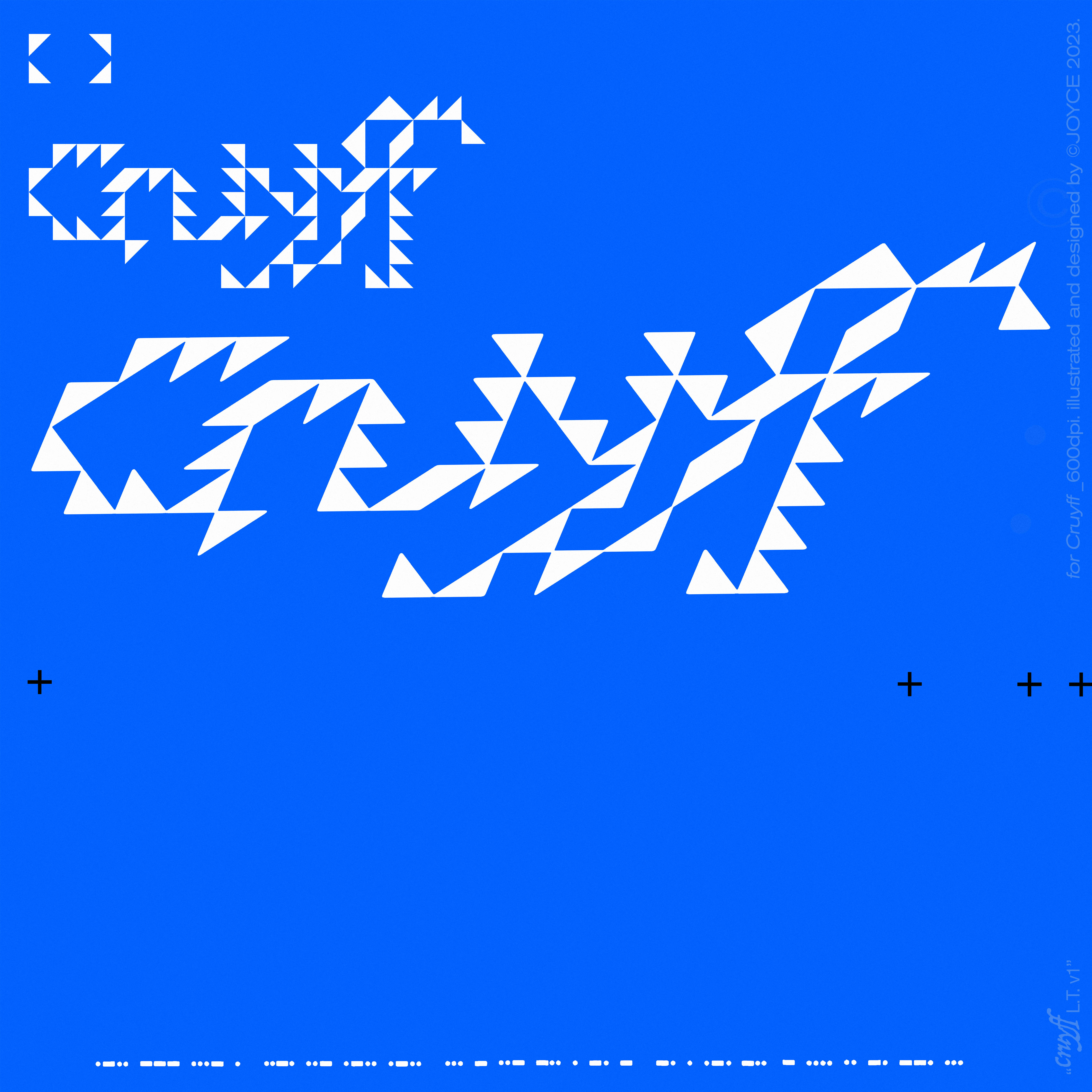
J-CRYF-01
2023
2023
“lovefullstudentnerdthings”
©JOYCE for Cruyff
Illustration, Graphic Design, Identity, Product + Package Design
Cruyff is a punk+alternative rock band based in Tokyo, Japan. “lovefullstudentnerdthings”︎︎︎ is the first album of this genre I have the honour of visually representing. The challenge was to create something not often seen on albums within the genre, while staying true to their existing sounds and respective inspirations, which was a diverse selection of sounds and media that aren’t directly or typically associated with the genre’s known aesthetics. This was a dynamic I wanted to play with, as I felt it would be interesting to give a new visual presence to this style of music and their style of sound:
The artworks feature a graphite illustration as per the band’s request and it was composed to exaggerate the interplay between rough and violent illustrative elements and controlled and sleek digital graphic elements- I had gravitated towards this duality after listening to the band’s music and learning a little more about its members.
As the band was a relatively new and upcoming one, I decided it would be cool to design a special logotype for their use on future projects. This logotype is based off a typeface found on their first EP, “hot/iden”︎︎︎.
Additionally provided were further designs for cassette / J-Card product + packaging.
Released in 2023.
Mixed media,
Graphite on paper, 8.5”x11”
+ Digital media, collage, and colour,
600dpi
Category:
SERVICE
SERVICE


